Build and visualize
The Build and visualize tab shows all your pipes. Pipes start as your data sources which you then run through various tools to transform and manage your data. For example, you may create a pipe to remove certain columns from your data, or add new columns that compound two previously existing columns. The data that comes out the end of the pipe is transformed to meet your needs.
Exploring the pipe builder
You can use Varicent Sales Planning's Integrations features to explore and visualize your data in new and exciting ways. One of the first things you should do is familiarize yourself with the pipe builder.
You can open the pipe builder from the Build and visualize tab by clicking an existing pipe to edit or by creating a new pipe.
Here's an overview of the pipe builder's user interface:
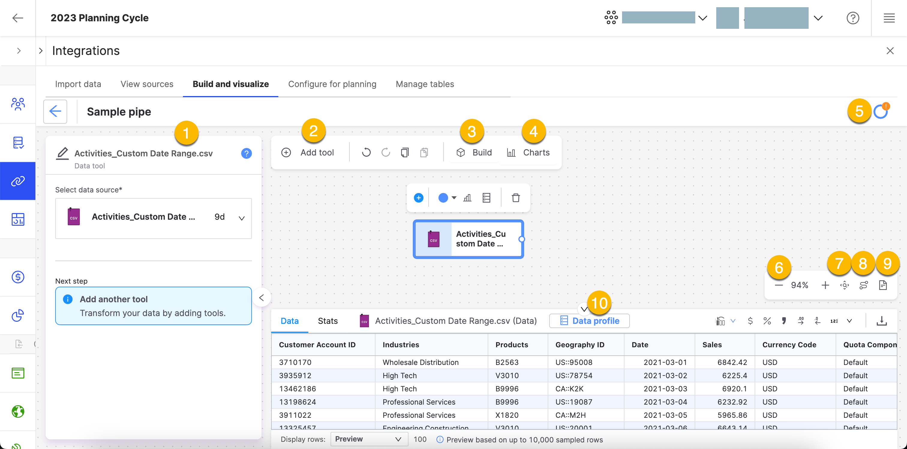
Tasks
The Tasks bar shows tools that aren't configured, or that are invalid. If you don't have any tasks left, your pipe is ready for a build!
 Add tool
Click this button to add tools to your pipe.
Tip
You can also just type the name of a tool to bring up the tool menu.
Build
When you finish configuring your pipe, click . If there is a machine learning tool in your pipe, such as the predictor, you can build the pipe to calculate the score.
Tip
It's a good idea to build your pipe often! This will make sure your pipe builds quickly.
Charts
Click to create a chart of your pipe. Choose your chart type or visualization.
Status menu
Displays the status of your imports, builds, downloads and exports.
Zoom in or out
Increase or decrease the size of your canvas.
 Auto arrange
Automatically arranges all the components of your pipe to neatly align each one. This button also creates a uniform length for each of your connectors.
 Zoom to fit
The window zooms in or out so all objects are visible.
 Open Notes
Click this button to add notes to your pipe. Your notes can be customized to insert pictures, formulas, charts, emojis, and a table of contents. You can also export your notes into a PDF. This button can also be used to close or hide the Notes sidebar.
Row viewer
Row Viewer is a visual formatting option, supporting 500-plus columns. For more information, see ???.
Pipe builder tips
Learn tips on how to use the Pipe builder more effectively.
Learn tips on how to use the Pipe builder more effectively.
Moving a node:
Choose one or more nodes individually to move around on the canvas. Use
ControlorCommandand click to select the nodes, depending on your operating system.Grouping nodes:
Choose two or more nodes to group together. The grouping shows the number of tools contained within that group. With a group, you can perform the following actions:
Name the node group.
Move the node group around the canvas.
View the contents of the node group.
Ungroup the node group.
Moving a group of nodes:
Choose a group of nodes to move around on the canvas. Use Shift and drag the group to the desired location.
Creating a pipe
To build a pipe, start by bringing in a data source. You can then transform or clean up your data.
On the Planning cycles home page, click the planning cycle to open.
Click the Command center icon
 .
.Under the Admin section, click Integrations.
Click the Build and visualize tab.
Click Create new pipe.
A Data tool is added by default.
To configure the Data tool, select a data source from the menu or start a new import.
Add any additional tools by typing the tool name or clicking
 Add tool.
Tip
We use natural language processing in the Tool window, so you don't have to type the tool name exactly. For example, you can type “Import” to bring up the data tool. For more information on the types of tools available, see Tools.
Configure any required fields for your tools in the side panel. The configuration steps depend on the tool.
Note
The pipe builder automatically saves the configuration.
Add a predict tool to your pipe.
Tip
If you're not sure which tool to use, just use Predictor for now!
Connect the tools by clicking the button next to the tool name and dragging a line to the next tool.
Tip
If you add a new tool while you have another tool selected, those tools will be connected automatically.
Add an tool as the last tool in your pipe. You'll need this to create and run configurations later on.
Note
By default, the Export tool is set up to export to CSV. You can leave it this way if you want to download your data locally, and then re-import by doing a regular file import. See, Importing data files into Varicent Sales Planning.
To create and run configurations, select the export connection you set up in the Getting started with Sales Planning Integrations section. This lets you lets you configure your data for planning using the Configure for planning tab, and then publish it as a data table on the Manage tables tab. Follow the sub-steps to do this.
Currently, you can only create configurations for Activity data.
Select the Export tool.
Under the Connection field, select your Varicent Sales Planning export connector from the drop-down list.
To identify your connection in the list when creating your configuration, rename it. Click the edit icon
 next to the Export tool name, and type a name for the connection.
Click .
Tip
Build your pipe often! Since builds are incremental, this ensures your pipe builds quickly.
A calculation will start. You can see it in the menu. When the calculation finishes, a score appears beside the tool name.
Note
Your pipe should have these 3 tools at a minimum: a data set, a predict tool, and an export tool.
Tool recommendations
You can use tool recommendations to help you choose your next tool. Sales Planning Integrations shows users a recommended toolset based on the previous tool selection.
The recommendations appear when you do one of the following tasks:
Open the pipe builder with a tool selected.
Add a tool to an existing pipe with the Add tool button or by typing.
Tools
Use tools to add data, predict, prepare, clean and more to build your pipe.
Build your pipe using various tools available to add data, predict, prepare, and clean. We have many different types of tools to choose from and get the most out of your data:
Calculate tools to determine numbers or amounts of combined values.
Clean tools to clean up your data before using it effectively.
Combine tools for when you want to merge and join data.
Data tools to add, supplement or export data.
Learn tools to understand and make predictions with your data.
Organize tools to label and change the layout of your data.
Sales Performance tools to aggregate your data for analytic purposes.
Creating charts from the pipe builder
Use charts to explore your data in visual form. Once you create charts, you can add them to a dashboard. This helps you organize your charts and create visual representations of your data.
Note
You can view your dashboards from the Dashboards tab. See, Dashboards.
On the Planning cycles home page, click the planning cycle to open.
Click the Command center icon
.Under the Admin section, click Integrations.
Click the Build and visualize tab.
Click an existing pipe to open the pipe builder, or create a new pipe.
Click Charts.
Click Create charts.
Configure the chart:
Click Untitled to name the chart.
On the Setup tab, configure the following fields:
Note
Depending on the chart type, there will be more fields to configure. These fields are extra to the ones mentioned in the following table.
Field
Description
Tool
Select the tool that you want to use for the chart.
Show
Select the data that you want to see, such as preview or last built.
Chart type
Select the type of chart that you want to use. Choose from line, area, column, bar, pie, scatter, map, table, histogram, combo, candlestick, radar, waterfall, forecast, sankey, heatmap, and boxplot charts.
Configure the fields specific to your chart type. This usually involves selecting the columns to use when creating your chart.
On the Customize tab, configure the following settings:
Note
Not all of these settings are available for all chart types.
Field
Description
Chart and axis titles
Select the options that you want to include, Include chart title, Include chart subtitle, and Include horizontal axis title.
Horizontal axis label angle
Select the angle from 0 to 90 degrees.
Include vertical axis title
Select if you want to include a vertical axis title. If yes, give the axis a title.
Vertical axis label angle
Select the angle from 0 to 90 degrees.
Left margin, Right margin, Top margin, Bottom margin
Select the margin spacing for the left, right, top and bottom margins.
Colour
Select the colours for your chart. Use the color picker or input a hex or RGBA number.
Legend
Select Include legend to add a legend.
Position
Select the position for the legend. Choose from bottom left, bottom center, bottom right, middle left, middle right, top left, top center or top right.
Charts
Put your data in a visual form with one of our many charts.
We have a variety of charts for you to explore or for you to share your data in visual form.
Charts
Put your data in a visual form with one of our many charts.
Sales Planning Integrations has a variety of charts to explore or share your data in visual form.
Which chart should I use?
The type of visualization you choose depends on what kind of data you have, what questions you want to answer, and how you want to present your insights.
Note
If you use the Row Viewer Format , the formatting applies to your charts. The new format is immediately active after you choose it.
Here are some suggested charts you might use to answer different questions.
Sales Planning Integrations has many options to show changes to values over time. If you're looking to show data broken down by sub-groups, try out a stacked area step line chart. If you want to show irregularities in changes over time, use a step line chart.
Both stacked area step line charts and stacked area smooth line charts show a starting set of values, and then use shading to show values above that starting set.
To understand the frequency of values, use a histogram. To show the frequency of events within a group, use a boxplot.
A forecasting chart displays the actual historical values, fitted historical values, predicted future values, and the shaded confidence interval. You can use this visualization with any tool in Sales Planning Integrations.
A waterfall chart can help you understand what variables affect your predictions, as well as the cumulative effects of values. Waterfall charts are often used to show changes in revenue across two periods of time.
Radar charts can be helpful for showing budgets.
Use these charts to show ranked values or the relative value of different grouped categories.
Use these charts when you want to show how the proportion of different groupings relates to one another.
Use maps to show spatial data and scatter maps to show precise locations on a map.
Scatter plots are good for exploring relationships between two variables.
A candlestick chart shows price movements for a security, derivative, or currency.
A Sankey diagram shows how sets of values flow from one another.
A heat map uses color to show how a variable is clustered or occurs most frequently.
Customize chart visualizations
Customize chart visualizations to suit your visual needs.
Sales Planning Integrations has a variety of visualizations to explore or share your data in chart form. You can customize charts to suit your visual needs.
In Sales Planning Integrations, go to the Pipes page and select a pipe.
On the toolbar, click the Chart button.
Note
If you don't have any charts created, click Create Chart. After you create your chart, you can customize it.
Go to the Customize tab and select any of the following options to customize your chart:
Table 6. Customization optionsOption
Description
Chart and title axis
Include the chart title, subtitle, horizontal and vertical axis titles. You can angle the horizontal and vertical axis titles to any angle, such as a 45-degree angle. Change the left, right, top or bottom margins.
Colour
Use the color picker to customize the color of your data. You can also add effects such as gradient or shadows for bubble and bubble single axis charts.
Legend
Include a legend for your data and choose the position, such as top, middle or bottom and place it in the center, right, or left.
Area line
Use to show magnitude or change over time.
Use the Area line chart to show magnitude or change over time. The Area line chart can help visualize trends by highlighting how values can change over time and show cumulative totals.
An area chart is similar to a line chart, but with shaded areas between the line and the axis:

Input
The Area line chart requires numeric columns to use in the chart.
Configuration
Use the following configuration options to configure the Area line chart.
Note
The Configuring the Area line chart gives configuration options through the Pipe module. If you have already created charts, you can access them through your Dashboards.
In the Pipe builder, add at least one data source to your pipe. For more information on adding a data source, see the ??? tool.
Add tools to build out your pipe. For more information about adding tools to your pipe, see the Using the Pipe builder canvas documentation.
Create a chart from your pipe by clicking Charts on the canvas toolbar.
Click Create Chart.
The chart page opens.
In the configuration pane, enter the following information:
Table 7. Area Line chart configurationField
Description
Setup tab
The Setup tab allows you to define the tool, chart type and other settings.
Tool
Select the tool in your pipe that you want to create a chart for.
Chart type
Type Area line and click on the Area line graphic to select it.
X axis
Select the column to use as the X axis.
Series
Select the column to use for the chart.
Advanced section
The Advanced section allows you to configure output settings to ensure accurate and efficient data processing and visualization.
Show
Select either Preview or Last built.
Preview displays the first 100 rows of your data from your last build.
Last build displays the first 1000 rows of your entire dataset from your last build.
Sort
Select to sort your chart data by None, Ascending or Descending.
Aggregate?
Click the Aggregate? checkbox to aggregate your chart data.
All
Calculate all columns that you select with one of the following operations:
Sum
Count
Average
Max
Min
Median
OR
AND
STDEV
Series
Calculate the series column with one of the following operations:
Sum
Count
Average
Max
Min
Median
OR
AND
STDEV
Customize section
The Customize tab allows you to configure the output settings to ensure compelling visualizations.
Chart and axis titles
Select the following to add titles to your charts:
Include chart title
Include chart subtitle
Include horizontal axis title
Horizontal axis label angle
Select the degree from the drop-down list of the angle for the horizontal axis label.
Include vertical axis title checkbox
Select to add the vertical axis title.
Vertical axis label angle
Select the degree from the drop-down list of the angle for the vertical axis label.
Left margin
Enter the padding for the left margin or click the arrows to increase or decrease the number.
Right margin
Enter the padding for the right margin or click the arrows to increase or decrease the number.
Top margin
Enter the padding for the top margin or click the arrows to increase or decrease the number.
Bottom margin
Enter the padding for the bottom margin or click the arrow to increase or decrease the number.
Colour
Click on the column colour to change it.
Legend
Select the Include legend checkbox to add a legend to your chart.
Usage example
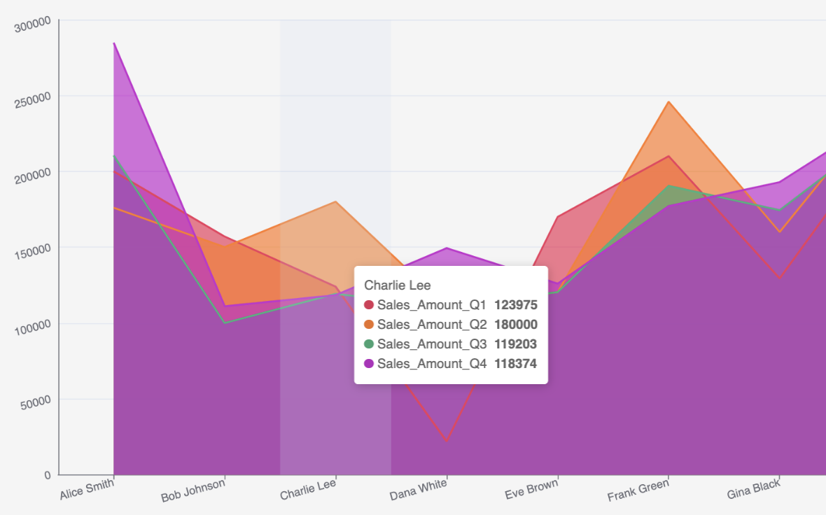
For example, you want to see the difference between each of your sellers sales amounts for every quarter in 2024. Using the Area line chart, the data displays the amounts for each seller.
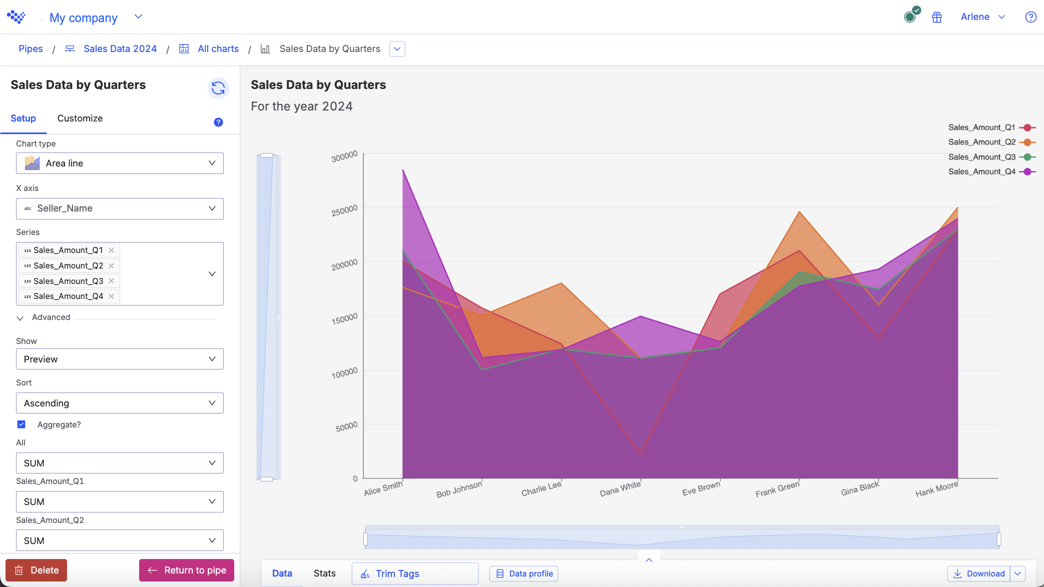
The Area line chart displays the sellers sale amounts for each quarter.
When you hover over each point in the chart, you can see the data for an individual seller:
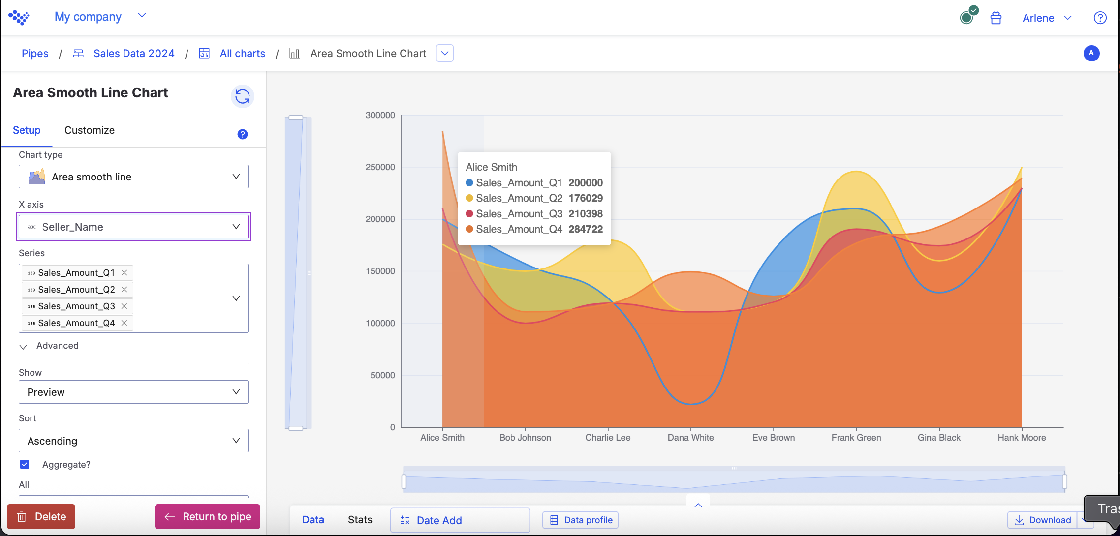
Area smooth line
Use the Area smooth line chart to show magnitude or change over time.
Use the Area smooth line chart to show magnitude or change over time. The Area smooth line chart can help visualize trends by highlighting how values can change over time and show cumulative totals.
An area smooth line is similar to an area line, but with the lines between data points smoothed out.

Input
The Area smooth line chart requires both text and numeric columns to use in the chart.
Configuration
Use the following configuration options to configure the Area smooth line chart.
Note
The Configuring the Area smooth line chart gives configuration options through the Pipe module. If you have already created charts, you can access them through your Dashboards.
In the Pipe builder, add at least one data source to your pipe. For more information on adding a data source, see the ??? tool.
Add tools to build out your pipe. For more information about adding tools to your pipe, see the Using the Pipe builder canvas documentation.
Create a chart from your pipe by clicking Charts on the canvas toolbar.
Click Create Chart.
The chart page opens.
In the configuration pane, enter the following information:
Table 8. Area smooth line chart configurationField
Description
Setup tab
The Setup tab allows you to define the tool, chart type and other settings.
Tool
Select the tool in your pipe that you want to create a chart for.
Chart type
Type Area smooth line and click on the Area smooth line graphic to select it, or press enter.
X axis
Select the numeric column to use as the X axis.
Y axis
Select the numeric column to use as the Y axis.
Series
Select the text or numeric column to use for the chart.
Advanced section
The Advanced section allows you to configure output settings to ensure accurate and efficient data processing and visualization.
Show
Select either Preview or Last built
Preview displays the first 100 rows of your data from your last build.
Last build displays the first 1000 rows of your entire dataset from your last build.
Size
Select the numeric column to use for the size.
Sort
Select to sort your chart data by None, Ascending or Descending.
Aggregate?
Click the Aggregate? checkbox to aggregate your chart data.
All
Calculate all columns that you select with one of the following operations:
Sum
Count
Average
Max
Min
Median
OR
AND
STDEV
Customize tab
The Customize tab allows you to configure the output settings to ensure compelling visualizations.
Chart and axis titles
Select the following to add titles to your charts:
Include chart title
Include chart subtitle
Include horizontal axis title
Horizontal axis label angle
Select the degree from the drop-down list of the angle for the horizontal axis label.
Include vertical axis title checkbox
Select to add the vertical axis title.
Vertical axis label angle
Select the degree from the drop-down list of the angle for the vertical axis label.
Left margin
Enter the padding for the left margin or click the arrows to increase or decrease the number.
Right margin
Enter the padding for the right margin or click the arrows to increase or decrease the number.
Top margin
Enter the padding for the top margin or click the arrows to increase or decrease the number.
Bottom margin
Enter the padding for the bottom margin or click the arrow to increase or decrease the number.
Colour
Click on the column colour to change it.
Legend
Select the Include legend checkbox to add a legend to your chart.
Usage example
For example, you want to see the difference between each of your sellers sales amounts for every quarter in 2024. Using the Area smooth line chart, the data displays the amounts for each seller.
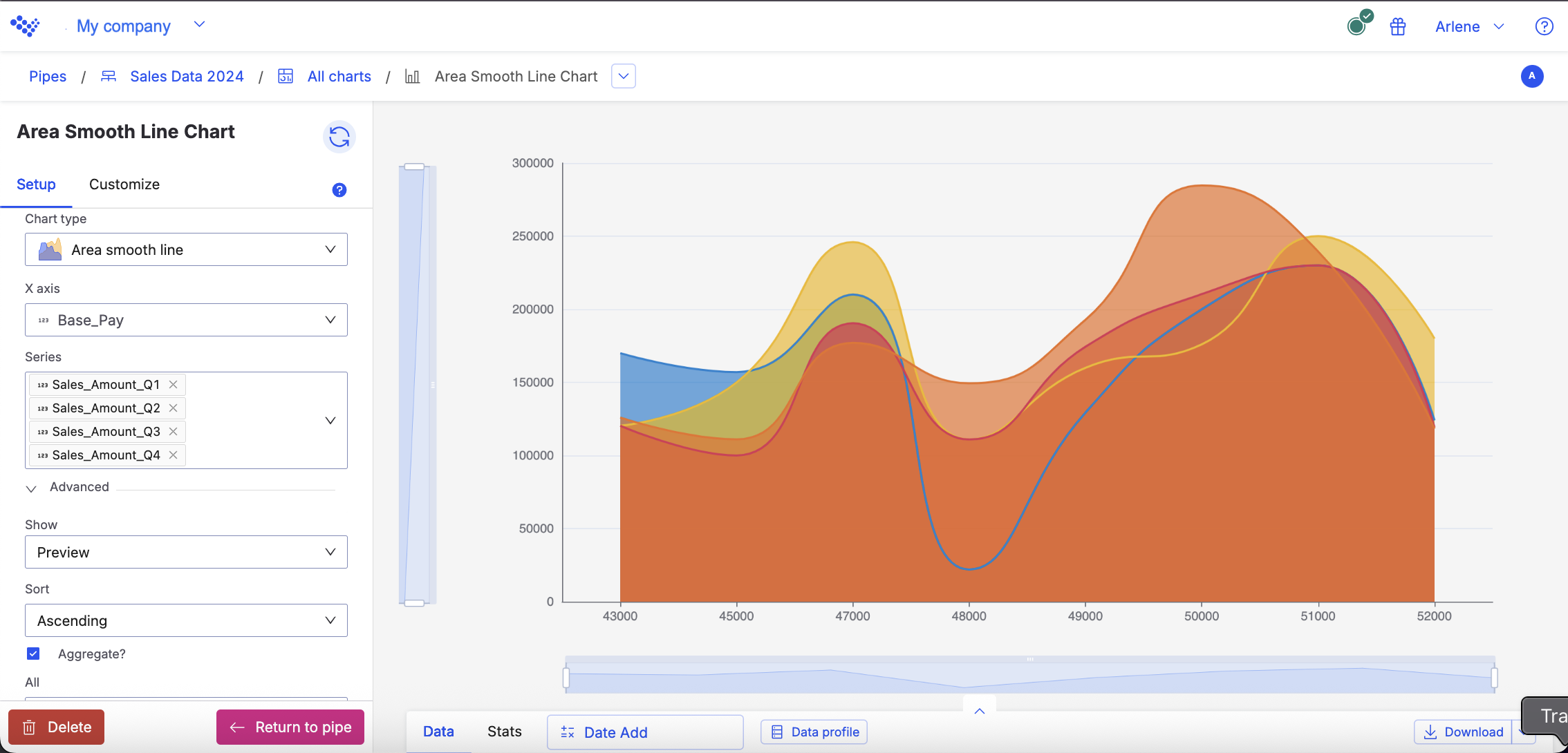
The Area smooth line chart displays the sellers sale amounts for each quarter.
When you hover over each point in the chart, you can see the data for an individual seller:
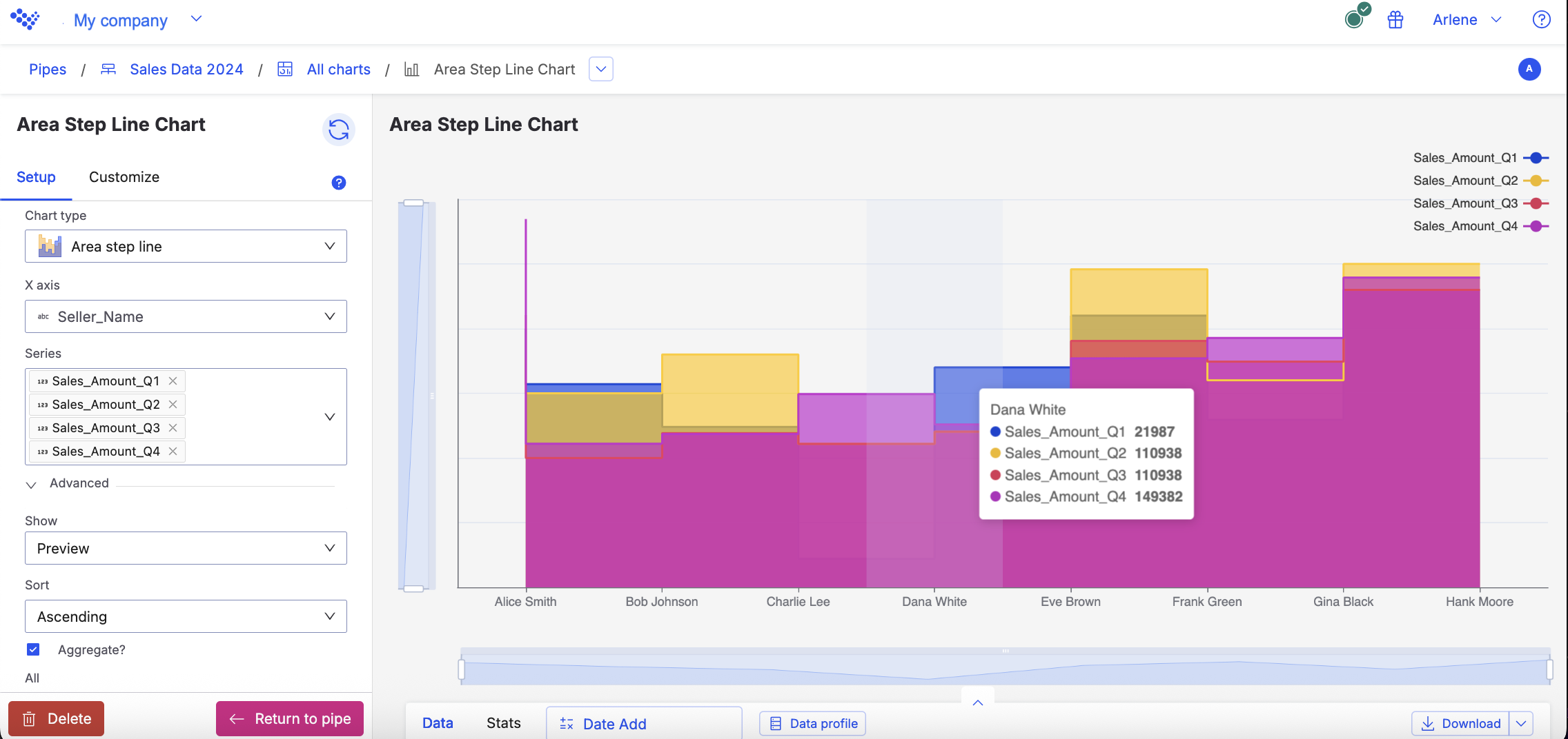
Area step line
Use to show magnitude or change over time.
Use the Area step line chart when you want to show magnitude or change over time. The Area step line chart is similar to the area line, but with vertical and horizontal lines between data points instead of straight lines.

Input
The Area step line chart requires text and numeric columns.
Configuration
Use the following configuration options to configure the Area step line chart.
Note
The Configuring the Area step line chart gives configuration options through the Pipe module. If you have already created charts, you can access them through your Dashboards.
In the Pipe builder, add at least one data source to your pipe. For more information on adding a data source, see the ??? tool.
Add tools to build out your pipe. For more information about adding tools to your pipe, see the Using the Pipe builder canvas documentation.
Create a chart from your pipe by clicking Charts on the canvas toolbar.
Click Create Chart.
The chart page opens.
In the configuration pane, enter the following information:
Table 9. Area step line chartField
Description
Setup tab
The Setup tab allows you to define the tool, chart type and other settings.
Tool
Select the tool in your pipe that you want to create a chart for.
Chart type
Type Area step line and click on the Area line graphic to select it.
X axis
Select the column to use as the X axis.
Series
Select the column to use for the chart.
Advanced section
The Advanced section allows you to configure output settings to ensure accurate and efficient data processing and visualization.
Show
Select either Preview or Last built.
Preview displays the first 100 rows of your data from your last build.
Last build displays the first 1000 rows of your entire dataset from your last build.
Sort
Select to sort your chart data by None, Ascending or Descending.
Aggregate?
Click the Aggregate? checkbox to aggregate your chart data.
All
Calculate all columns that you select with one of the following operations:
Sum
Count
Average
Max
Min
Median
OR
AND
STDEV
Customize section
The Customize tab allows you to configure the output settings to ensure compelling visualizations.
Chart and axis titles
Select the following to add titles to your charts:
Include chart title
Include chart subtitle
Include horizontal axis title
Horizontal axis label angle
Select the degree from the drop-down list of the angle for the horizontal axis label.
Include vertical axis title checkbox
Select to add the vertical axis title.
Vertical axis label angle
Select the degree from the drop-down list of the angle for the vertical axis label.
Left margin
Enter the padding for the left margin or click the arrows to increase or decrease the number.
Right margin
Enter the padding for the right margin or click the arrows to increase or decrease the number.
Top margin
Enter the padding for the top margin or click the arrows to increase or decrease the number.
Bottom margin
Enter the padding for the bottom margin or click the arrow to increase or decrease the number.
Colour
Click on the column colour to change it.
Legend
Select the Include legend checkbox to add a legend to your chart.
Usage example
For example, you want to see the difference between each of your sellers sales amounts for every quarter in 2024. Using the Area step line chart, the data displays the amounts for each seller.
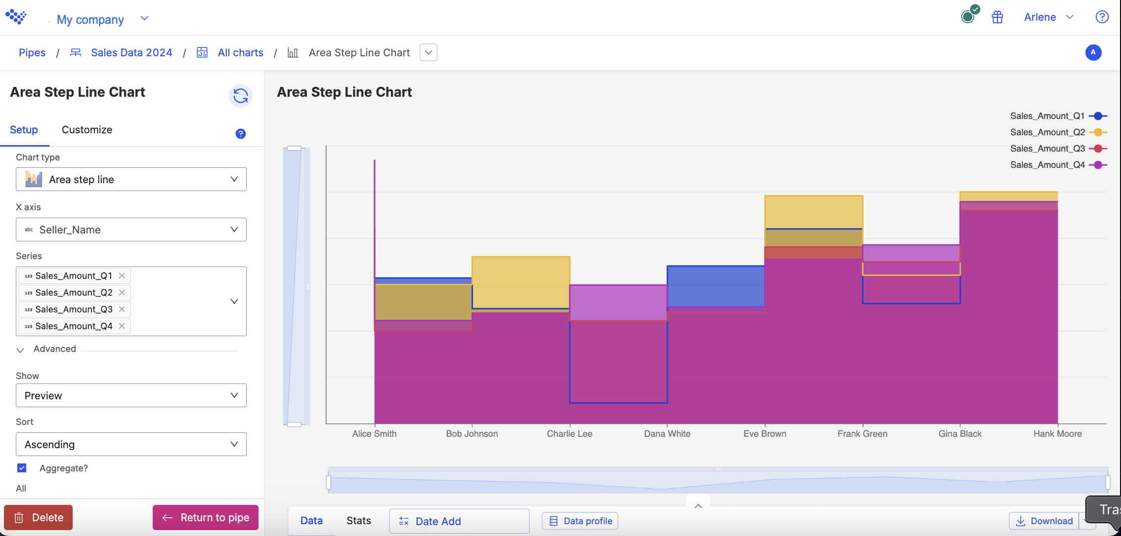
The Area line chart displays the sellers sale amounts for each quarter.
When you hover over each point in the chart, you can see the data for an individual seller:
Bar
Use to show the relative value of different grouped categories or to show ranked values.
Use the Bar chart to show the relative value of different grouped categories or to show ranked values. A bar chart is useful when comparing categories with long labels or when you want to visualize your data sorted by rank, from ascending to descending values.

Tip
For vertical bars, use a column chart.
Input
The Column chart requires numeric columns.
Configuration
Use the following configuration options to configure the Bar chart.
Tip
The Configuring the Bar chart gives configuration options through the Pipe module.If you have already created charts, you can access them through your Dashboards.
In the Pipe builder, add at least one data source to your pipe. For more information on adding a data source, see the ??? tool.
Add tools to build out your pipe. For more information about adding tools to your pipe, see the Using the Pipe builder canvas documentation.
Create a chart from your pipe by clicking Charts on the canvas toolbar.
Click Create Chart.
The chart page opens.
In the configuration pane, enter the following information:
Table 10. Bar chart configurationField
Description
Setup tab
The Setup tab allows you to define the tool, chart type and other settings.
Tool
Select the tool in your pipe that you want to create a chart for.
Chart type
Type Bar and click on the Bar graphic to select it.
Y axis
Select the text or numeric column to use as the Y axis.
Series
Select the numeric column to use for the chart.
Advanced section
The Advanced section allows you to configure output settings to ensure accurate and efficient data processing and visualization.
Show
Select either Preview or Last built.
Preview displays the first 100 rows of your data from your last build.
Last build displays the first 1000 rows of your entire dataset from your last build.
Sort
Select to sort your chart data by None, Ascending or Descending.
Aggregate?
Click the Aggregate? checkbox to aggregate your chart data.
All
Calculate all columns that you select with one of the following operations:
Sum
Count
Average
Max
Min
Median
OR
AND
STDEV
Selected column
Calculate the series column with one of the following operations:
Sum
Count
Average
Max
Min
Median
OR
AND
STDEV
Customize section
The Customize tab allows you to configure the output settings to ensure compelling visualizations.
Chart and Axis titles
Select the following to add titles to your charts:
Include chart title
Include chart subtitle
Include horizontal axis title
Horizontal axis label angle
Select the degree from the drop-down list of the angle for the horizontal axis label.
Include vertical axis title
Select the checkbox to add the vertical axis title.
Vertical axis label angle
Select the degree from the drop-down list of the angle for the vertical axis label.
Left margin
Enter the padding for the left margin or click the arrows to increase or decrease the number.
Right margin
Enter the padding for the right margin or click the arrows to increase or decrease the number.
Top margin
Enter the padding for the top margin or click the arrows to increase or decrease the number.
Bottom margin
Enter the padding for the bottom margin or click the arrow to increase or decrease the number.
Colour
Click on the column colour to change it.
Legend
Select the Include legend checkbox to add a legend to your chart.
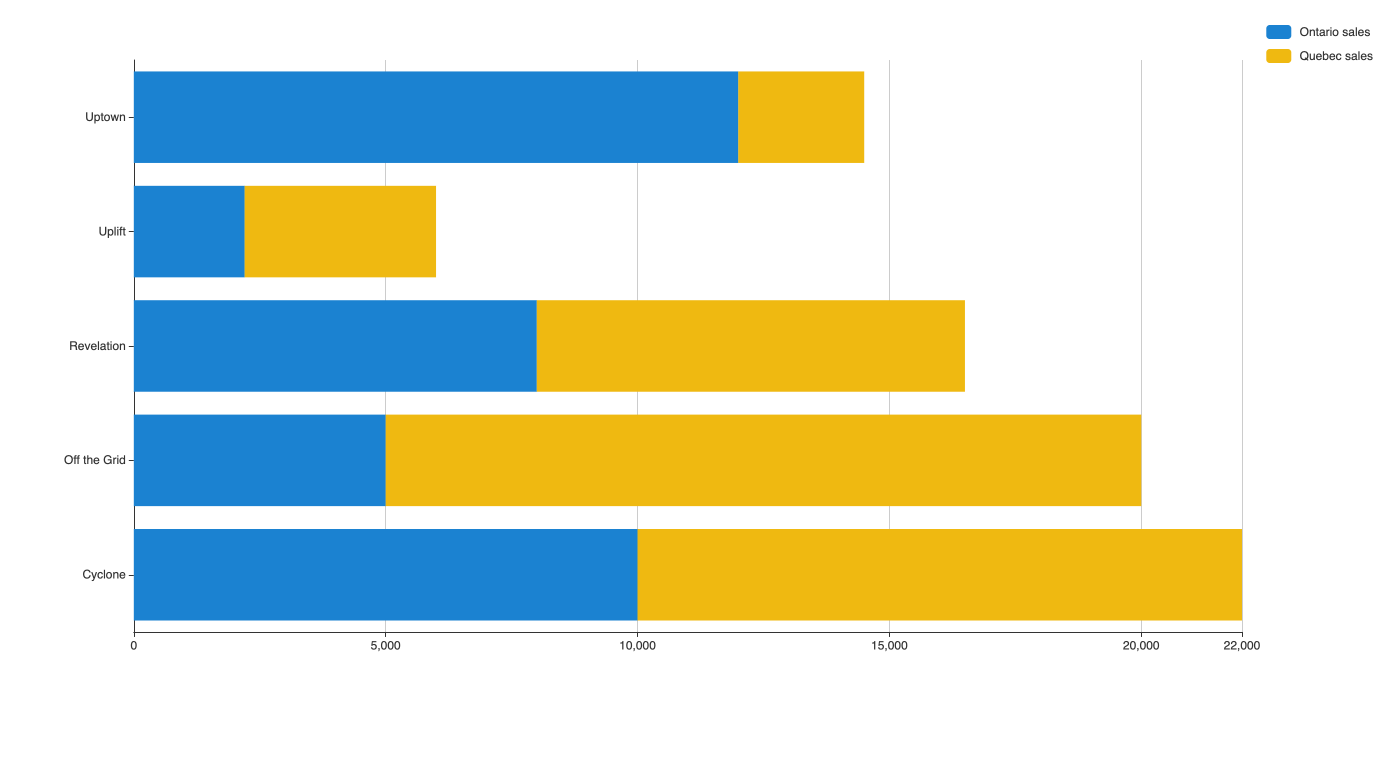
Stacked bar
Use the Stacked bar chart to show the relative value of different grouped categories or to show ranked values.
Use the Stacked bar chart to show the relative value of different grouped categories or to show ranked values.
A stacked bar chart shows data represented by horizontal rectangular bars with comparative values stacked on top of each other.

The length of the rectangle is proportional to the value it represents. Each group is represented by two or more horizontal bars.
Note
If some of your categories contain negative values, use a standard bar chart instead.
Input
The Column chart requires numeric columns.
Configuration
Use the following configuration options to configure the Stacked Bar chart.
Note
The Configuring the Stacked Bar chart gives configuration options through the Pipe module. If you have charts already created, you can access them through your Dashboards.
In the Pipe builder, add at least one data source to your pipe. For more information on adding a data source, see the ??? tool.
Add tools to build out your pipe. For more information about adding tools to your pipe, see the Using the Pipe builder canvas documentation.
Create a chart from your pipe by clicking Charts on the canvas toolbar.
Click Create Chart.
The chart page opens.
In the configuration pane, enter the following information:
Table 11. Stacked Bar chart configurationField
Description
Setup tab
The Setup tab allows you to define the tool, chart type and other settings.
Tool
Select the tool in your pipe that you want to create a chart for.
Chart type
Type Stacked bar and click on the Stacked bar graphic to select it.
X axis
Select the column to use as the X axis.
Series
Select the column to use for the chart.
Advanced section
Show
Select either Preview or Last built.
Preview displays the first 100 rows of your data from your last build.
Last build displays the first 1000 rows of your entire dataset from your last build.
Sort
Select to sort your chart data by None, Ascending or Descending.
Aggregate?
Click the Aggregate? checkbox to aggregate your chart data.
All
Calculate all columns that you select with one of the following operations:
Sum
Count
Average
Max
Min
Median
OR
AND
STDEV
Selected column
Calculate the series column with one of the following operations:
Sum
Count
Average
Max
Min
Median
OR
AND
STDEV
Customize section
Chart and Axis titles
Select the following to add titles to your charts:
Include chart title
Include chart subtitle
Include horizontal axis title
Horizontal axis label angle
Select the degree from the drop-down list of the angle for the horizontal axis label.
Include vertical axis title checkbox
Select to add the vertical axis title.
Vertical axis label angle
Select the degree from the drop-down list of the angle for the vertical axis label.
Left margin
Enter the padding for the left margin or click the arrows to increase or decrease the number.
Right margin
Enter the padding for the right margin or click the arrows to increase or decrease the number.
Top margin
Enter the padding for the top margin or click the arrows to increase or decrease the number.
Bottom margin
Enter the padding for the bottom margin or click the arrow to increase or decrease the number.
Colour
Click on the column colour to change it.
Legend
Select the Include legend checkbox to add a legend to your chart.
Usage example
In this example, we want to show revenue for different products in two locations.
Each bar shows the difference in revenue between both locations for each product. However, this chart also shows the total revenue for each product.
Boxplot
Use the Boxplot chart to show the frequency of events within a group.
Use the Boxplot chart to show the frequency of events within a group. A Boxplot is a distribution chart that represents groups of data by using quartiles.

Each box shows the middle quartiles of the data set. The "whiskers" show the remaining quartiles of the data set. Outliers (if you choose to include them) appear as points outside of the box and whisker plot.
Input
The Boxplot chart can use both text and numeric columns.
Configuration
Use the following configuration options to configure the Boxplot chart.
Note
The Configuring the Boxplot chart gives configuration options through the Pipe module. If you have charts already created, you can access them through your Dashboards.
In the Pipe builder, add at least one data source to your pipe. For more information on adding a data source, see the ??? tool.
Add tools to build out your pipe. For more information about adding tools to your pipe, see the Using the Pipe builder canvas documentation.
In the configuration pane, enter the following information:
Table 12. Boxplot chart configurationField
Description
Setup tab
Tool
Select the tool in your pipe that you want to create a chart for.
Chart type
Type Boxplot and click on the Boxplot graphic to select it.
Y axis
Select the text or numeric column to use as the Y axis.
Partition by
Select the numeric column to use to partition.
Min
Select the numeric column to use for the min quartile.
Lower
Select the numeric column to use for the lower quartile.
Median
Select the numeric column to use for the median quartile.
Upper
Select the numeric column for the upper quartile.
Max
Select the numeric column for the maximum quartile.
Series
Select the numeric column to use for the chart.
Advanced section
Show
Select either Preview or Last built.
Preview displays the first 100 rows of your data from your last build.
Last build displays the first 1000 rows of your entire dataset from your last build.
Sort
Select to sort your chart data by None, Ascending or Descending.
Customize section
Chart and Axis titles
Select the following to add titles to your charts:
Include chart title
Include chart subtitle
Include horizontal axis title
Horizontal axis label angle
Select the degree from the drop-down list of the angle for the horizontal axis label.
Include vertical axis title checkbox
Select to add the vertical axis title.
Vertical axis label angle
Select the degree from the drop-down list of the angle for the vertical axis label.
Left margin
Enter the padding for the left margin or click the arrows to increase or decrease the number.
Right margin
Enter the padding for the right margin or click the arrows to increase or decrease the number.
Top margin
Enter the padding for the top margin or click the arrows to increase or decrease the number.
Bottom margin
Enter the padding for the bottom margin or click the arrow to increase or decrease the number.
Colour
Click on the column colour to change it.
Legend
Select the Include legend checkbox to add a legend to your chart.
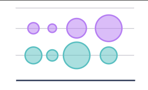
Bubble
Use the Bubble chart when you want to show magnitude.
Use the Bubble chart when you want to show magnitude.
A bubble chart shows three dimensions of data.

Each bubble represents a data point with 3 variables. Variable 1 and variable 2 determines the bubble's location on the horizontal and vertical axis. Variable 3 determines the bubble's size.
A bubble chart is similar to a scatter plot where a third variable is added to determine the size of the bubbles.
Input
The Bubble chart can use both text and numeric input.
Configuration
Use the following configuration options to configure the Bubble chart.
Note
The Configuring the Bubble chart gives configuration options through the Pipe module. If you have charts already created, you can access them through your Dashboards.
In the Pipe builder, add at least one data source to your pipe. For more information on adding a data source, see the ??? tool.
Add tools to build out your pipe. For more information about adding tools to your pipe, see the Using the Pipe builder canvas documentation.
Create a chart from your pipe by clicking Charts on the canvas toolbar.
Click Create Chart.
The chart page opens.
In the configuration pane, enter the following information:
Table 13. Bubble chart configurationField
Description
Setup tab
The Setup tab allows you to define the tool, chart type and other settings.
Tool
Select the tool in your pipe that you want to create a chart for.
Chart type
Type Bubble and click on the Bubble graphic to select it.
X axis
Select the column to use as the X axis.
Y axis
Select the numeric column to use as the Y axis.
Series
Select the text or numeric column to use for the chart.
Advanced section
The Advanced section allows you to configure output settings to ensure accurate and efficient data processing and visualization.
Show
Select either Preview or Last built
Preview displays the first 100 rows of your data from your last build.
Last build displays the first 1000 rows of your entire dataset from your last build.
Size
Select the numeric column to use for the size.
Sort
Select to sort your chart data by None, Ascending or Descending.
Customize tab
The Customize tab allows you to configure the output settings to ensure compelling visualizations.
Chart and axis titles
Select the following to add titles to your charts:
Include chart title
Include chart subtitle
Include horizontal axis title
Horizontal axis label angle
Select the degree from the drop-down list of the angle for the horizontal axis label.
Include vertical axis title checkbox
Select to add the vertical axis title.
Vertical axis label angle
Select the degree from the drop-down list of the angle for the vertical axis label.
Left margin
Enter the padding for the left margin or click the arrows to increase or decrease the number.
Right margin
Enter the padding for the right margin or click the arrows to increase or decrease the number.
Top margin
Enter the padding for the top margin or click the arrows to increase or decrease the number.
Bottom margin
Enter the padding for the bottom margin or click the arrow to increase or decrease the number.
Colour
Click on the column colour to change it.
Legend
Select the Include legend checkbox to add a legend to your chart.
Bubble Single-Axis
Use to show data in a linear form.
A bubble single-axis chart shows data in a linear form.
When to use this tool
Use a categorical variable for the Y-axis, such as day of the week. The X-axis can be any type of ordinal variable. Choose a numeric variable for setting the size of the bubbles that appear in the chart.
You can sort this chart by the X-axis values in either ascending or descending order.
Candlestick
A candlestick chart shows price movements for a security, derivative, or currency.
Use a Candlestick chart if you want to show price movements for a security, derivative, or currency.

Each "candlestick" shows information for that day. The "body" shows the open and close prices, and the "candle wick" shows the high and low prices.
Input
The Candlestick chart requires numeric columns to use in the chart.
Configuration
Use the following configuration options to configure the Candlestick chart.
Note
The ??? gives configuration options through the Pipe module.If you have already created charts, you can access them through your Dashboards.
In the Pipe builder, add at least one data source to your pipe. For more information on adding a data source, see the ??? tool.
Add tools to build out your pipe. For more information about adding tools to your pipe, see the Using the Pipe builder canvas documentation.
Create a chart from your pipe by clicking Charts on the canvas toolbar.
Click Create Chart.
The chart page opens.
In the configuration pane, enter the following information:
Table 14. Candlestick chart configurationField
Description
Setup tab
The Setup tab allows you to define the tool, chart type and other settings.
Tool
Select the tool in your pipe that you want to create a chart for.
Chart type
Type Candlestick and click on the Candlestick graphic to select it.
X axis
Select the column to use as the X axis.
Low
Select a numeric column to use as the low part of the candlestick.
Open
Select a numeric column to use as the open part of the candlestick.
Close
Select a numeric column to use as the closed part of the candlestick.
High
Select a numeric column to use as the highest part of the candlestick.
Advanced section
The Advanced section allows you to configure output settings to ensure accurate and efficient data processing and visualization.
Show
Select either Preview or Last built
Preview displays the first 100 rows of your data from your last build.
Last build displays the first 1000 rows of your entire dataset from your last build.
Sort
Select to sort your chart data by None, Ascending or Descending.
Customize tab
The Customize tab allows you to configure the output settings to ensure compelling visualizations.
Chart and axis titles
Select the following to add titles to your charts:
Include chart title
Include chart subtitle
Include horizontal axis title
Horizontal axis label angle
Select the degree from the drop-down list of the angle for the horizontal axis label.
Include vertical axis title checkbox
Select to add the vertical axis title.
Vertical axis label angle
Select the degree from the drop-down list of the angle for the vertical axis label.
Left margin
Enter the padding for the left margin or click the arrows to increase or decrease the number.
Right margin
Enter the padding for the right margin or click the arrows to increase or decrease the number.
Bottom margin
Enter the padding for the bottom margin or click the arrow to increase or decrease the number.
Colour
Click on the column colour to change it.
Legend
Select the Include legend checkbox to add a legend to your chart.
Column
A column chart shows represented by vertical rectangular bars.
Use the Column chart to show the relative value of different grouped categories or to show ranked values. A column chart shows data represented by vertical rectangular bars.

Tip
For horizontal bars, use a bar chart.
The length of the rectangle is proportional to the value it represents.
Input
The Column chart requires numeric columns.
Configuration
Use the following configuration options to configure the Column chart.
Note
The Configuring the Column chart gives configuration options through the Pipe module. If you have charts already created, you can access them through your Dashboards.
In the Pipe builder, add at least one data source to your pipe. For more information on adding a data source, see the ??? tool.
Add tools to build out your pipe. For more information about adding tools to your pipe, see the Using the Pipe builder canvas documentation.
Create a chart from your pipe by clicking Charts on the canvas toolbar.
Click Create Chart.
The chart page opens.
In the configuration pane, enter the following information:
Table 15. Column chart configurationField
Description
Setup tab
The Setup tab allows you to define the tool, chart type and other settings.
Tool
Select the tool in your pipe that you want to create a chart for.
Chart type
Type Column and click on the Area line graphic to select it.
X axis
Select the column to use as the X axis.
Series
Select the column to use for the chart.
Advanced section
The Advanced section allows you to configure output settings to ensure accurate and efficient data processing and visualization.
Show
Select either Preview or Last built.
Preview displays the first 100 rows of your data from your last build.
Last build displays the first 1000 rows of your entire dataset from your last build.
Sort
Select to sort your chart data by None, Ascending or Descending.
Aggregate?
Click the Aggregate? checkbox to aggregate your chart data.
All
Calculate all columns that you select with one of the following operations:
Sum
Count
Average
Max
Min
Median
OR
AND
STDEV
Selected column(s)
Calculate the selected column with one of the following operations:
Sum
Count
Average
Max
Min
Median
OR
AND
STDEV
Customize section
The Customize tab allows you to configure the output settings to ensure compelling visualizations.
Chart and Axis titles
Select the following to add titles to your charts:
Include chart title
Include chart subtitle
Include horizontal axis title
Horizontal axis label angle
Select the degree from the drop-down list of the angle for the horizontal axis label.
Include vertical axis title checkbox
Select to add the vertical axis title.
Vertical axis label angle
Select the degree from the drop-down list of the angle for the vertical axis label.
Left margin
Enter the padding for the left margin or click the arrows to increase or decrease the number.
Right margin
Enter the padding for the right margin or click the arrows to increase or decrease the number.
Top margin
Enter the padding for the top margin or click the arrows to increase or decrease the number.
Bottom margin
Enter the padding for the bottom margin or click the arrows to increase or decrease the number.
Colour
Click on the column colour to change it.
Legend
Select the Include legend checkbox to add a legend to your chart.
Combo
A combo chart lets you display multiple data insights on the same chart.
A Combo chart lets you display multiple data insights on the same chart and visually highlight the differences between data sets. You can also customize each selected graph as you need.
You can combine these graph types:

Input
The Combo chart requires numeric columns.
Configuration
Use the following configuration options to configure the Combo chart.
Note
The Configuring the Combo chart gives configuration options through the Pipes module. If you have charts already created, you can access them through your Dashboards.
In the Pipe builder, add at least one data source to your pipe. For more information on adding a data source, see the ??? tool.
Add tools to build out your pipe. For more information about adding tools to your pipe, see the Using the Pipe builder canvas documentation.
Create a chart from your pipe by clicking Charts on the canvas toolbar.
Click Create Chart.
The chart page opens.
In the configuration pane, enter the following information:
Table 16. Combo chart configurationField
Description
Setup tab
The Setup tab allows you to define the tool, chart type and other settings.
Tool
Select the tool in your pipe that you want to create a chart for.
Chart type
Type Combo and click on the Combo graphic to select it.
X axis
Select the column to use as the X axis.
Series
Select one or more columns to use as the data you want to analyze.
Advanced section
The Advanced section allows you to configure output settings to ensure accurate and efficient data processing and visualization.
Show
Select either Preview or Last built
Preview displays the first 100 rows of your data from your last build.
Last build displays the first 1000 rows of your entire dataset from your last build.
Series type
Choose between Column or Line for each column.
Sort
Select to sort your chart data by Descending or Ascending, None.
Aggregate?
Click the Aggregate? checkbox to aggregate your chart data.
All
Calculate all columns that you select with one of the following operations:
Sum
Count
Average
Max
Min
Median
OR
AND
STDEV
Selected columns
Calculate the series column with one of the following operations:
Sum
Count
Average
Max
Min
Median
OR
AND
STDEV
Customize section
The Customize tab allows you to configure the output settings to ensure compelling visualizations.
Chart and Axis titles
Select the following to add titles to your charts:
Include chart title
Include chart subtitle
Include horizontal axis title
Horizontal axis label angle
Select the degree from the drop-down list of the angle for the horizontal axis label.
Include vertical axis title checkbox
Select to add the vertical axis title.
Vertical axis label angle
Select the degree from the drop-down list of the angle for the vertical axis label.
Left margin
Enter the padding for the left margin or click the arrows to increase or decrease the number.
Right margin
Enter the padding for the right margin or click the arrows to increase or decrease the number.
Top margin
Enter the padding for the top margin or click the arrows to increase or decrease the number.
Bottom margin
Enter the padding for the bottom margin or click the arrows to increase or decrease the number.
Axis
Select the left or right access to plot on the chart for each column.
Colour
Click on the column colour to change it.
Legend
Select the Include legend checkbox to add a legend to your chart.
Doughnut
Use the Doughnut chart to show how the proportion of different groupings relates to one another.
Use the Doughnut chart to show how the proportion of different groupings relates to one another. When comparing the performance of different segments or categories, a doughnut chart can effectively highlight which segments are larger or smaller in comparison, aiding in comparative analysis. The Doughnut chart can be a good alternative to a pie chart if you have a lot of slices, making it difficult to read.

Input
The Doughnut chart requires numeric columns.
Configuration
Use the following configuration options to configure the Doughnut chart.
Note
The Configuring the Doughnut chart gives configuration options through the Pipe module. If you have charts already created, you can access them through your Dashboards.
In the Pipe builder, add at least one data source to your pipe. For more information on adding a data source, see the ??? tool.
Add tools to build out your pipe. For more information about adding tools to your pipe, see the Using the Pipe builder canvas documentation.
Create a chart from your pipe by clicking Charts on the canvas toolbar.
Click Create Chart.
The chart page opens.
In the configuration pane, enter the following information:
Table 17. Doughnut chart configurationField
Description
Setup tab
The Setup tab allows you to define the tool, chart type and other settings.
Tool
Select the tool in your pipe that you want to create a chart for.
Chart type
Type Doughnut and click on the Doughnut graphic to select it.
Label
Select the column to use for the chart label.
Value
Select a numeric column to use for the values.
Advanced section
The Advanced section allows you to configure output settings to ensure accurate and efficient data processing and visualization.
Show
Select either Preview or Last built.
Preview displays the first 100 rows of your data from your last build.
Last build displays the first 1000 rows of your entire dataset from your last build.
Sort
Select to sort your chart data by None, Ascending or Descending.
Aggregate?
Click the Aggregate? checkbox to aggregate your chart data.
All
Calculate all columns that you select with one of the following operations:
Sum
Count
Average
Max
Min
Median
OR
AND
STDEV
Selected column
Calculate the series column with one of the following operations:
Sum
Count
Average
Max
Min
Median
OR
AND
STDEV
Customize section
The Customize tab allows you to configure the output settings to ensure compelling visualizations.
Chart and Axis titles
Select the following to add titles to your charts:
Include chart title
Include chart subtitle
Include horizontal axis title
Horizontal axis label angle
Select the degree from the drop-down list of the angle for the horizontal axis label.
Include vertical axis title checkbox
Select to add the vertical axis title.
Vertical axis label angle
Select the degree from the drop-down list of the angle for the vertical axis label.
Left margin
Enter the padding for the left margin or click the arrows to increase or decrease the number.
Right margin
Enter the padding for the right margin or click the arrows to increase or decrease the number.
Top margin
Enter the padding for the top margin or click the arrows to increase or decrease the number.
Bottom margin
Enter the padding for the bottom margin or click the arrows to increase or decrease the number.
Colour
Click on the column colour to change it.
Legend
Select the Include legend checkbox to add a legend to your chart.
Forecasting
Use to forecast future changes to your dataset.
Use the Forecasting chart when you want to forecast future changes to your dataset. A forecasting chart is a line chart that displays:
Actual historical values
Fitted historical values (calculated by Sales Planning Integrations)
Predicted future values (calculated by Sales Planning Integrations)
Shaded confidence interval
Tip
You can use this visualization with any tool in Sales Planning Integrations.

Input
The Forecasting chart requires date, numeric, and boolean type columns.
Configuration
Use the following configuration options to configure the Forecasting chart.
Note
The Configuring the Forecasting chart gives configuration options through the Pipe module. If you have charts already created, you can access your charts through your Dashboards.
In the Pipe builder, add at least one data source to your pipe. For more information on adding a data source, see the ??? tool.
Add tools to build out your pipe. For more information about adding tools to your pipe, see the Using the Pipe builder canvas documentation.
Create a chart from your pipe by clicking Charts on the canvas toolbar.
Click Create Chart.
The chart page opens.
In the configuration pane, enter the following information:
Table 18. Forecasting chart configurationField
Description
Setup tab
Tool
Select the tool in your pipe that you want to create a chart for.
Chart type
Type Forecasting and click on the Forecasting graphic to select it.
X-axis
Select a date column to use as the X axis.
Historical values
Select a numerical column to use for Historical values.
Forecasted values
Select a numerical column to use for Forecasted values.
Is forecast
Select a boolean column to use for Is forecast.
Lower range
Select a numerical column to use for Lower range.
Upper range
Select a numerical column to use for Upper range.
Advanced section
Show
Select either Preview or Last built
Preview displays the first 100 rows of your data from your last build.
Last build displays the first 1000 rows of your entire dataset from your last build.
Analyze by
Select none, one or more date columns to analyze the forecast by.
After you select the date columns to use, two fields named Forecast 1 and Forecast 2 appear. Select the time from the drop-down list. Ensure that the dates are unique.
Customize tab
Chart and axis titles
Select the following to add titles to your charts:
Include chart title
Include chart subtitle
Include horizontal axis title
Horizontal axis label angle
Select the degree from the drop-down list of the angle for the horizontal axis label.
Include vertical axis title checkbox
Select to add the vertical axis title.
Vertical axis label angle
Select the degree from the drop-down list of the angle for the vertical axis label.
Left margin
Enter the padding for the left margin or click the arrows to increase or decrease the number.
Right margin
Enter the padding for the right margin or click the arrows to increase or decrease the number.
Top margin
Enter the padding for the top margin or click the arrows to increase or decrease the number.
Bottom margin
Enter the padding for the bottom margin or click the arrows to increase or decrease the number.
Colour
Click on the column colour to change it.
Legend
Select the Include legend checkbox to add a legend to your chart.
Heatmap
A heatmap uses color to show how a variable is clustered or occurs most frequently.
A heatmap uses color to show how a variable is clustered or occurs most frequently.
A median aggregation is selected by default. You can configure the aggregation from the Configure bar:
Sum: the total value of the column.
Median: the middle value of the column.
Count: the number of rows that are in the column.
Max: the highest value in the column.
Min: the lowest value in the column.

When to use this tool
Use when you want to reveal patterns or show the concentration of events.
Histogram
A histogram shows a distribution of values.
A histogram shows a distribution of values.

A histogram is like a column chart, as both count the frequency of values.
Tip
To quickly add a histogram: in the Add tool window, start typing "histogram" and press tab to auto-complete. Then start typing the name of the column and press tab to auto-complete. You'll see a histogram with those values without needing to configure it.
When to use this tool
Use when you want to count the occurrences of values in a column.
Line
Use when you want to show a magnitude or change over time.
A line chart shows information as a series of data points connected by a line.

When to use this tool
Use when you want to show magnitude or change over time.
Map
Use when you want to show spatial data.
A map is a spatial chart that shows location.

To create a map, your data set must include some geographic data.
When to use this tool
Use when you want to show spatial data.
Nested pie
Use nested pie charts to show an entire hierarchical data in a snapshot.
A nested pie chart is a hierarchical pie chart showing the proportions of values in a data set. The inner pie represents categories, while the outer ring represents sub-categories.

When to use this tool
Use nested pie charts when you want to show an entire hierarchical data in a snapshot. Nested pie charts can be used to show various data types like:
Organization hierarchies
Multi-tiered data
Interlinked tree data
Categorial breakup
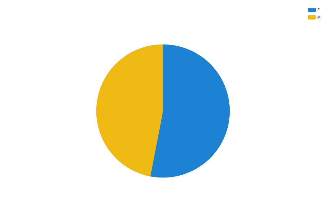
Pie
Use the pie chart to show how the proportion of different groupings relate to one another.
A pie chart shows proportions of values in a data set.

When to use this tool
Use when you want to show how the proportion of different groupings relate to one another.
If you have a lot of slices, pie charts can be difficult to read. Other charts that show proportional values include bar charts and box plots.
Example
In this example, we use a pie chart to show the breakdown of men versus women working in a company.
Radar
Use the radar chart to show how qualitative data points compare to one another.
A radar chart shows 3 or more variables represented on an axis starting from the same point.

When to use this tool
Use this chart to show how qualitative data points compare to one another.
Example
Radar charts can be helpful for showing budgets.
Sankey
Use a Sankey chart when visualizing the flow between sets of values.
A Sankey chart is great to use when visualizing the flow between sets of values. A more complex Sankey will have multiple levels. To build a Sankey chart in Sales Planning Integrations, we require the following pieces of information:
From - First column of the Sankey chart
To - Final column of the Sankey chart
Value - Numerical

To create a Sankey diagram, you need to have data segmented into categories.
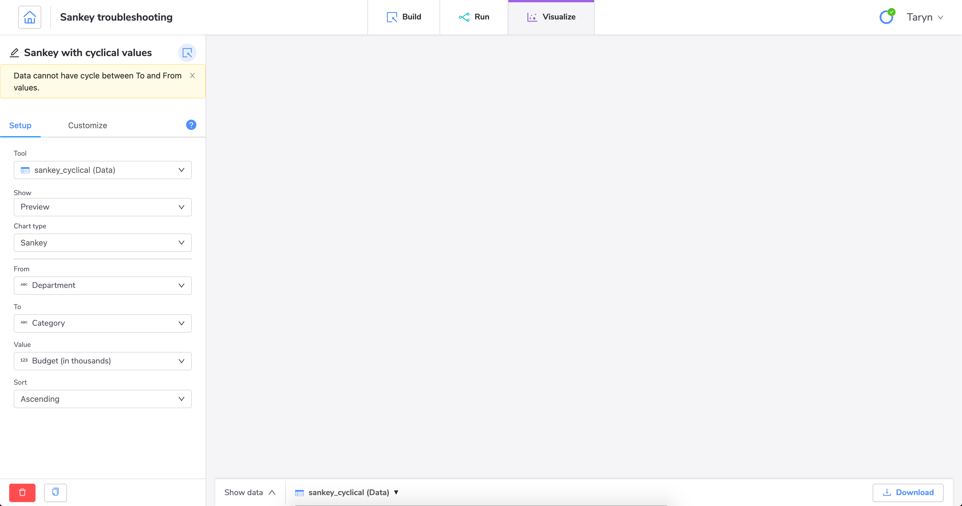
Caution
You cannot create a Sankey diagram with cyclical values. The From and To fields cannot contain the same values if they would flow into each other. Put another way, if a value would flow from one category into the same category, this will cause an error.
When to use this tool
Use a Sankey diagram when you want to show how values map between two categories.
Example
You could use a Sankey chart to show how budget categories flow into different departments. This is a simple example with only a few categories, but you can use Sankey diagrams to show complex value flows. Our example data set looks like this:
Department | Budget (in thousands) | Category |
|---|---|---|
Sales | 80 | Personnel |
Sales | 40 | IT |
Sales | 20 | Misc. |
Development | 120 | Personnel |
Development | 67 | IT |
Development | 30 | Misc. |
Support | 75 | Personnel |
Support | 45 | IT |
Support | 12 | Misc. |
HR | 72 | Personnel |
HR | 20 | IT |
HR | 10 | Misc. |
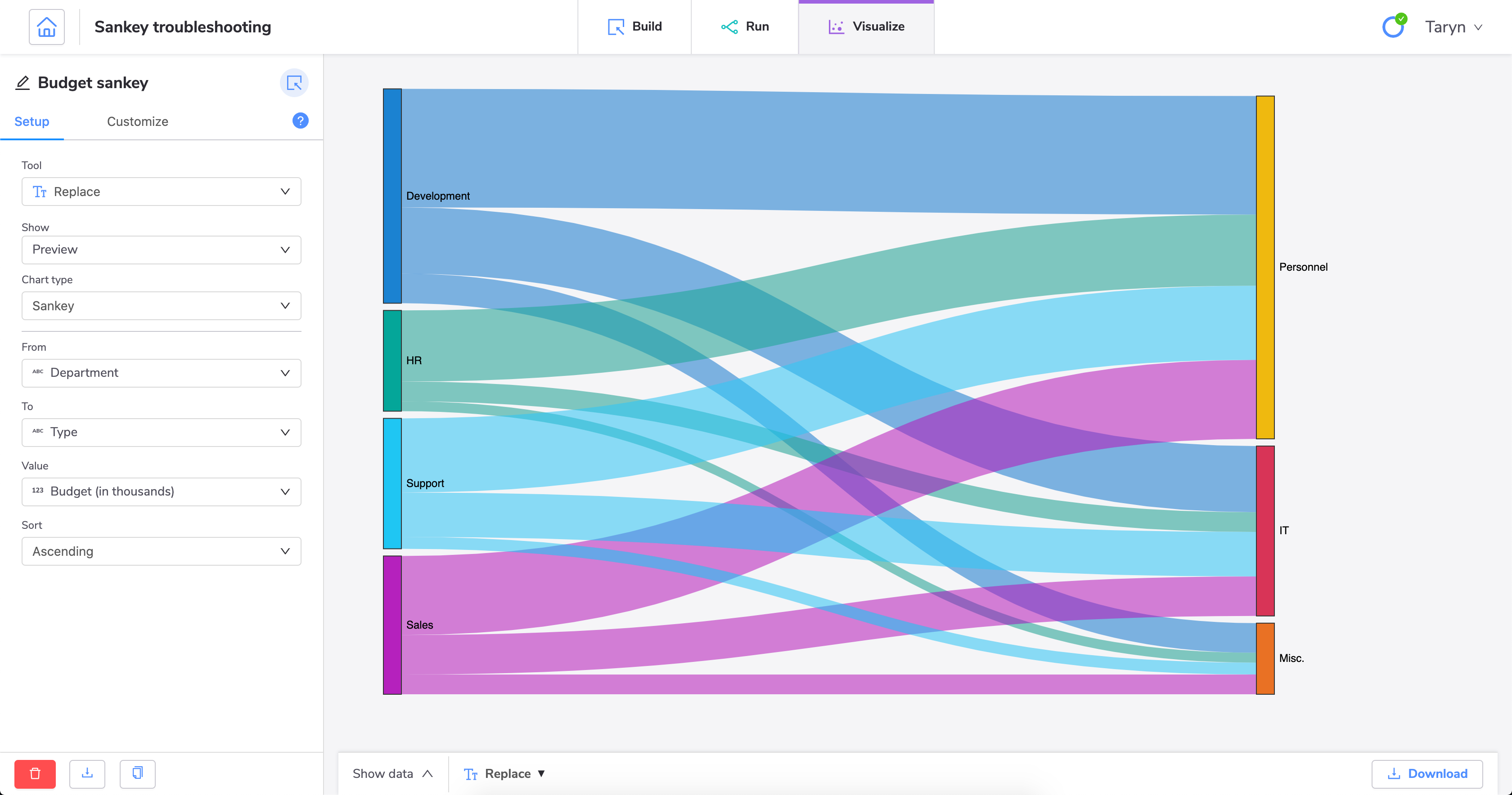
When we create a Sankey diagram using this data, we can show how each department's budget flows into the different categories. We can easily see which departments are spending the most in each category and how much of our total budget each category represents.
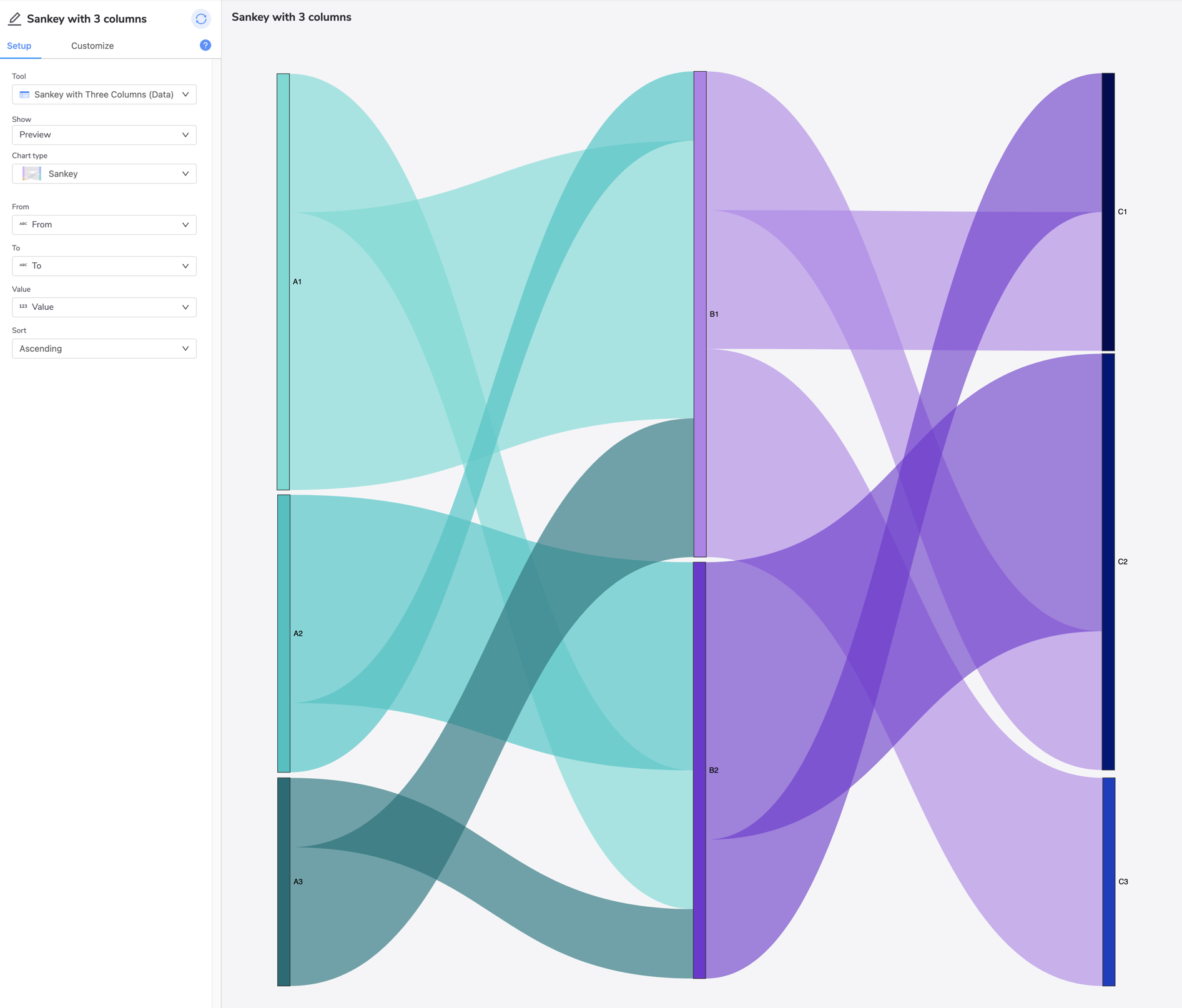
Creating a Sankey diagram with more than 2 columns
Tip
When creating a Sankey diagram with more than 2 columns, it is helpful to do some planning in advance, and consider how to organize your data set.
For example, below is a sample data set. Investigate and think about how A flows to B, and then B to C. Map and write that down before listing the ribbons below A.
From | To | Value |
|---|---|---|
A1 | B1 | 4 |
A1 | B2 | 2 |
A2 | B1 | 1 |
A2 | B2 | 3 |
A3 | B1 | 2 |
A3 | B2 | 1 |
B1 | C1 | 2 |
B1 | C2 | 2 |
B1 | C3 | 3 |
B2 | C1 | 2 |
B2 | C2 | 4 |
This data set illustrates this Sankey diagram:
Troubleshooting Sankey diagrams
If you're having trouble creating a Sankey diagram, it could be because you have cyclical values in your data set.
The easiest way to create a Sankey diagram without errors is to ensure you have distinct values for each category. The categories you define are used in the From and To fields when you configure the visualization.
Let's look at this example data set:
Department | Budget (in thousands) | Type |
|---|---|---|
Sales | 80 | HR |
Sales | 40 | IT |
Sales | 20 | Misc. |
Development | 120 | HR |
Development | 67 | IT |
Development | 30 | Misc. |
Support | 75 | HR |
Support | 45 | IT |
Support | 12 | Misc. |
HR | 72 | HR |
HR | 20 | IT |
HR | 10 | Misc. |
In this sample data set, we do not currently have distinct categories. We are using HR as a category in both the Department column and the Type column. If we try to create a Sankey diagram with these values, we'll get an error.
We can fix this by using the tool to change the HR value to a different value in one of the columns.
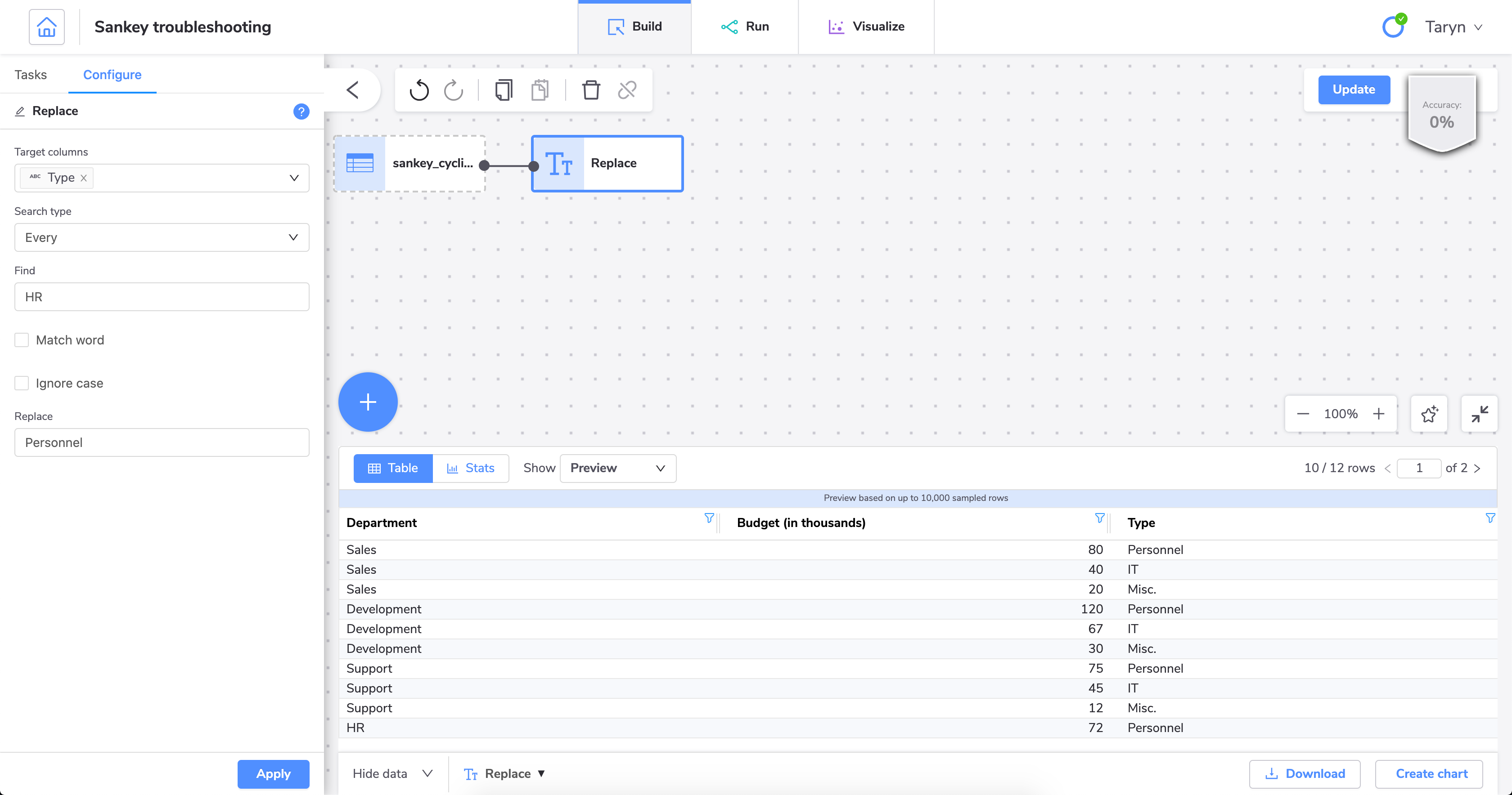
With this change, we can now successfully create a Sankey diagram.
Scatter
Use a scatter plot to show correlation between two variables.
A scatter plot uses coordinates to show values for two (or more) variables in a data set.

Each point represents one value, where the position on the horizontal and vertical axis are determined by two variables.
When to use this tool
Use when you want to show correlation between two variables. Use caution when showing correlation - remember, correlation does not equal causation. Good for exploring relationships rather than drawing conclusions.
Example
You could use a scatter plot to show the link between someone's lung capacity (variable one) and how long they can hold their breath (variable two).
Smooth line
Use a smooth line chat when you want to show magnitude or change over time.
Similar to a line chart, but with the lines between data points smoothed out.

When to use this tool
Use when you want to show magnitude or change over time.
Stacked area line
Use a stacked area line chart to show the total value of some data broken down by sub-groups.
A stacked area line is a type of area chart that shows connected data points with comparative values stacked on top of each other.

This chart shows a starting set of values, and then uses shading to show values above the starting values.
When to use this tool
Use when you want to show the total value of some data broken down by sub-groups.
Stacked area smooth line
Use the stacked area smooth line to show the total value of some data broken down by sub-groups.
A stacked area smooth line is similar to the stacked area line, but with the connecting line between data points smoothed out.

This chart shows a starting set of values, and then uses shading to show values above the starting values.
When to use this tool
Use when you want to show the total value of some data broken down by sub-groups.
Stacked area step line
Use the stacked area step line to show the total value of some data broken down by sub-groups.
A stacked area step line is similar to the stacked area line, but with vertical and horizontal lines between data points instead of straight lines.

This chart shows a starting set of values, and then uses shading to show values above the starting values.
When to use this tool
Use when you want to show the total value of some data broken down by sub-groups.
Step lines are useful particularly when you want to show irregularities in changes over time.
Stacked column
Use the stacked column chart to show the relative value of different grouped categories or to show ranked values.
A stacked column chart shows data represented by vertical rectangular bars with comparative values stacked on top of each other.

Each group is represented by two or more vertical bars. The length of the rectangle is proportional to the value it represents.
When to use this tool
The Column chart requires numeric columns.
If some of your categories contain negative values, use a standard column chart instead.
Example
In this example, we want to show revenue for different products in two locations.
Each bar shows the difference in revenue between both locations for each product. However, this chart also shows the total revenue for each product.
Step line
Use the step line chart when you want to show magnitude or change over time.
A step line chart is a line chart, but with each point connected by vertical and horizontal lines instead of straight points.

When to use this tool
Use when you want to show magnitude or change over time.
Step lines are useful particularly when you want to show irregularities in changes over time.
Scatter map
Use a scatter map to show precise locations on a map.
A scatter map is a type of spatial map that shows precise locations on a map.

If you don't need to show precise locations, you can use the general map visualization.
When to use this tool
Use when you want to show precise locations on a map.
Table
Use the table chart when you want to add tabular data to your chart dashboard.
A table is an arrangement of information or data in columns and rows.

You can customize each selected column in the Customize tab.
When to use this tool
Use table when you want to add tabular data, such as opportunity scores and seller leaderboard, to your chart dashboard.
Waterfall
Use the waterfall chart to help you understand cumulative effects of values.
A waterfall chart shows an initial value and final value with floating intermediate values that affect the initial value positively or negatively.

When to use this tool
A waterfall chart can help you understand cumulative effects of values.
Waterfall charts are commonly used to show changes in revenue across two periods of time.
Creating dashboards from the pipe builder
Dashboards help you organize your charts. If you have created charts for your pipe, you can create a dashboard for them directly from the pipe builder.
Note
You can also create dashboards from the Dashboards tab. See, Dashboards.
On the Planning cycles home page, click the planning cycle to open.
Click the Command center icon
.Under the Admin section, click Integrations.
Click the Build and visualize tab.
Click an existing pipe to open the pipe builder.
Click Charts.
Click All charts.
This option is only available if you have already created charts for this pipe.
Do one of the following:
Click Create dashboard from the Dashboards section.
This is only available if you haven't created any dashboards for this pipe yet.
Click the + Create new drop-down and select Create dashboard.
Click Untitled to name the dashboard.
Click Edit dashboard to add charts to your dashboard.
Select the charts to add to your dashboard, and then click Edit.
Click the edit icon
to add more charts or to add filters to your dashboard.Click the chart icon
 to add more charts to your dashboard.
Click the filter icon
 to add a filter.
Click the X icon to exit edit mode.
Your dashboard is now ready.
Tip
You can also add notes to individual charts. From your dashboard, click on the ellipses next to the chart you'd like to add notes to, then click View chart. A side panel will appear beside the selected chart for your notes.
With your dashboard set up, you can change the layout of your charts by resizing them.
Go to the selected chart.
Click the bottom right-hand corner of the tile and drag the corner of the tile to resize the tile into the desired size.
With your dashboard set up, you can change the layout of your charts by rearranging them.
Click the title of the selected chart.
Drag the chart to your desired location.